Have you ever noticed how so many websites and mobile applications look practically identical today? A massive hero image with a bold, left-aligned title, a couple of pill-shaped buttons, and a predictable grid of three feature blocks underneath.
This architectural repetition across the web isn't a coincidence. It is the tangible manifestation of herd mentality — the psychological phenomenon where individuals mimic the actions, trends, and behaviors of a larger group rather than making independent decisions based on contextual evidence.
In User Experience (UX) design, herd mentality cuts both ways. When deployed intentionally, it fosters an intuitive, globally predictable web. When followed blindly, however, it results in highly homogenized, sub-optimal products that fail the specific user bases they were engineered to serve.
The Good Herd: Consistency and Jakob’s Law
Conforming to the crowd in product design is not inherently flawed. In fact, standardizing specific interaction patterns is foundational to digital accessibility and seamless usability. This core tenant is perfectly encapsulated by Jakob’s Law:
"Users spend most of their time on other websites. This means that users prefer your site to work the same way as all the other sites they already know."
When a product team leans into established global design patterns, they dramatically reduce the user's cognitive load — the amount of mental processing power required to navigate an interface. Users should never have to guess how to perform basic actions. Certain "herd behaviors" have earned their place as absolute conventions:
- A shopping cart or profile icon belongs firmly in the top-right corner.
- Clicking a primary corporate logo must route the user back to the homepage.
- Underlined or distinctly colored text serves as the universal signal for a hyperlink.
By respecting these deep-seated mental models, you free your users to focus on your core content, value proposition, or product features, rather than forcing them to master a novel interface mechanism.
The Bad Herd: The Risks of Blind Replication
The system breaks down when product teams stop asking why. When a design trend gains viral traction, organizations frequently copy it simply because a major tech giant (such as Apple, Airbnb, or Stripe) pioneered it. This creates a dangerous feedback loop where questionable or contextually inappropriate design choices get replicated globally without validation.
1. The "Cargo Cult" Mistake
During World War II, certain isolated island communities witnessed military aircraft land with valuable cargo. Hoping to attract the planes back after the war, they constructed makeshift runways out of dirt and fashioned wooden headphones. They flawlessly replicated the form but completely missed the underlying infrastructure.
UX designers commit this exact error when they clone an interface layout from an industry giant without possessing their data, specific user demographics, or technical scale. What works flawlessly for a multi-billion-dollar platform may fail catastrophically for a niche enterprise software startup.
2. Loss of Brand Differentiation
When everyone follows identical design trends — whether it is the corporate illustrations of the late 2010s or the hyper-minimalist bento-box grids of today — products lose their visual and emotional identity. If you strip away the logo and the interface looks identical to three direct competitors, your UX has inadvertently stripped away the brand's competitive advantage.
The Feedback Paradox: A Real-World Case Study
To understand how easily herd mentality can distort objective design decisions, we look to a recent LinkedIn article poll analyzing login interface variants for a new food delivery application. The community was asked to evaluate three distinct layout strategies:
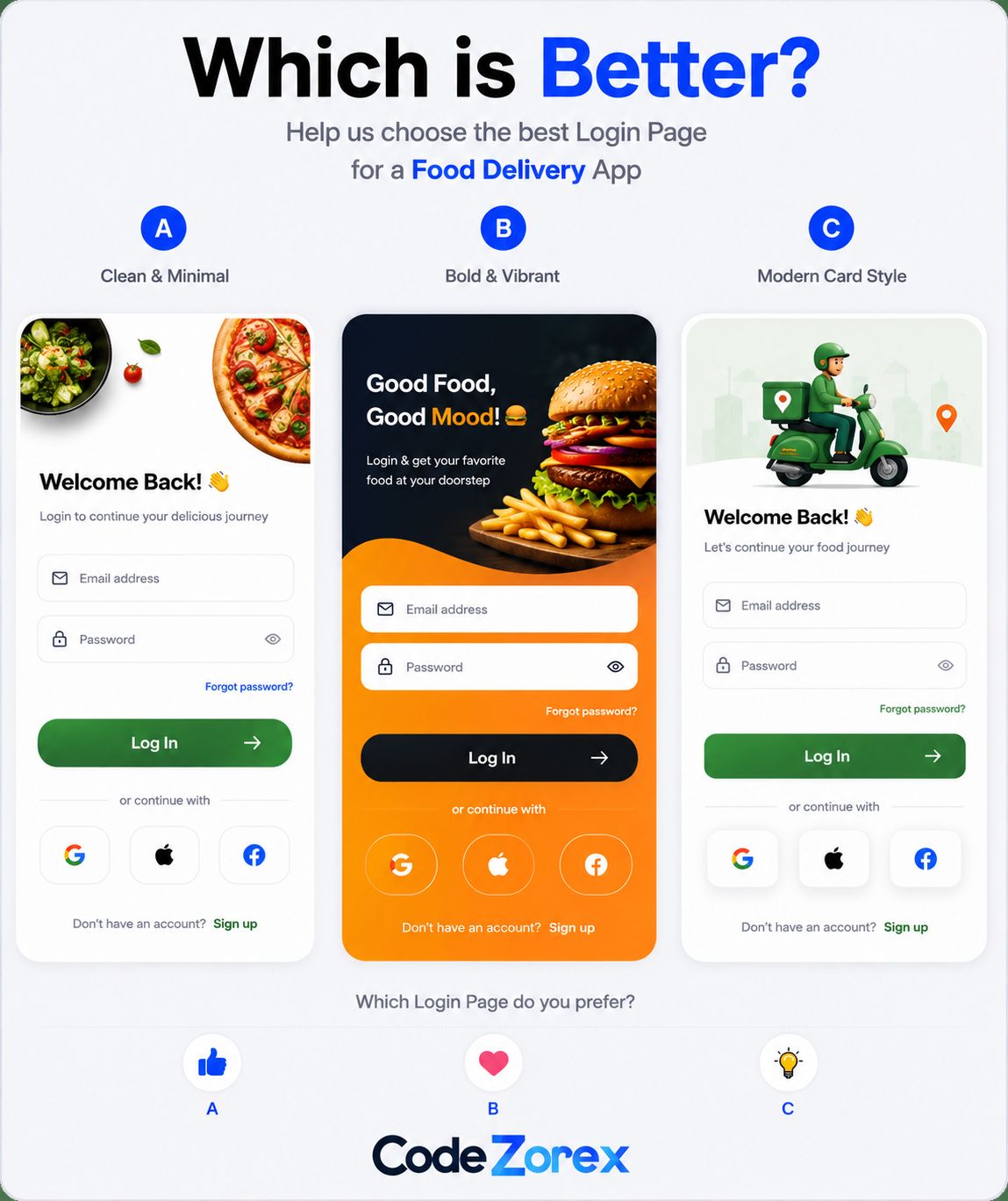
Image copied from CodeZorex founder Ayshan Musfik's post on LinkedIn.
- Option A (Clean & Minimal): Features top-down crisp food photography, crisp white card containers, and high contrast typography.
- Option B (Bold & Vibrant): Utilizes a heavy dark-to-orange background gradient, thick dark buttons, and an oversized fast-food burger illustration.
- Option C (Modern Card Style): Leverages clean 3D logistics illustrations representing delivery riders to segment content boxes.
The public comment section yielded an overwhelming, near-unanimous victory for Option B (Bold & Vibrant). However, a deeper demographic breakdown revealed a fascinating variable: the vast majority of those voters were software developers, not UX professionals or average consumer end-users.
This stark divergence highlights the gap between immediate visual stimulation and long-term operational usability. It uncovers three critical cognitive biases that fuel design herd behavior:
1. The Dark Mode & Tech Aesthetic Bias: Developers routinely spend 8 to 12 hours a day working inside dark, high-contrast code editors with vibrant syntax highlighting. To their eyes, Option B's intense orange-to-dark gradient looks exceptionally sleek and modern. Everyday hungry consumers, however, are often navigating the app while distracted, walking, or standing in bright sunlight where heavy background gradients cause significant glare and visual fatigue.
2. "Fun to Build" vs. "Effortless to Use": Front-end engineers naturally react to the artistic complexity and styling effort of an interface. Option B feels like a premium, custom-coded asset. Options A and C look deceptively "simple" by comparison. Yet, exceptional UX is frequently invisible. Option A is superior precisely because it removes itself from the user's way, maximizing appetite appeal, text contrast, and accessibility.
3. The Vacuum Voting Trap: When people vote on isolated social media graphics, they assess the layout in a static vacuum. They are not experiencing the app under real-world physical conditions. While Option B successfully captures immediate attention on a timeline, it introduces heavy cognitive friction during a high-intent user journey (logging in to order food).
💡 The Strategic Compromise: If your development team or stakeholders are deeply attached to a loud, high-energy trend like Option B, isolate the aesthetic to the App Splash Screen (the loading state). This anchors an exciting, vibrant brand tone instantly, before smoothly transitioning to the clean, frictionless architecture of Option A for the functional form fields where speed and ease-of-use are vital.
Cultural Anomalies: When "Clutter" Inverts the Herd
The dangers of blind compliance become even more stark when we cross cultural lines. Western design herds heavily police whitespace, aggressively simplifying interfaces to the point of abstraction. However, this standard completely falls apart when applied to markets like Japan.
International observers often look at major Japanese web portals—like Yahoo! Japan or Rakuten—and view them as chaotic anomalies trapped in the early 2000s, overflowing with dense text blocks, flashing banners, and dozens of crowded columns. Yet, as documented in comprehensive layout cultural analyses by Netwise and MultiLingual, this high density is an intentional, highly functional UX system.
This cultural divide operates on entirely different pillars of consumer psychology:
- Trust via Transparency: In Japan's high-context, risk-averse consumer culture, hiding product details behind minimalist "Learn More" or "Discover" links can breed profound suspicion. Consumers demand to see all technical specifications, shipping rules, options, and assurances upfront before converting. To a Japanese user, comprehensive detail equates to corporate honesty and thoroughness; structural minimalism feels like omission.
- The Marketplace Philosophy: While Western UX defaults to an elegant, curated boutique aesthetic, Japanese digital landscapes mirror the bustling energy of physical retail spaces (like the iconic discount store Don Quijote). Packing information tightly lets users scan, process, and discover deals inside a localized hub without forcing them to constantly navigate away to nested secondary pages.
- Linguistic Density Efficiency: The Japanese language utilizes a blend of Hiragana, Katakana, and logographic Kanji. Because Kanji characters contain dense semantic meanings packed into tiny square footprints, native readers can scan massive fields of text and absorb complex information substantially faster than a Western user reading sequential Latin characters. What looks like a distracting wall of noise to an outsider is an incredibly streamlined dashboard for the target audience.
If a design team blindly follows the dominant Western herd and builds a hyper-minimalist, airy e-commerce flow for a domestic Japanese market, they risk catastrophic drops in conversion. This highlights the ultimate lesson of UX psychology: context always beats the trend.
Interesting Resources for UX Study
If you are looking to step outside the vacuum of popular consensus and observe real-world product breakdowns, user psychology, and detailed micro-interactions, explore these curated platforms for deep-dive UX studies:
- Built for Mars — Exceptionally detailed user flow teardowns focusing on friction, usability, and functional design patterns across leading consumer tech products.
- Growth.design Case Studies — High-impact UX and behavioral psychology principles explained sequentially using an engaging interactive comic-book format.
- Hover States — A curated repository showcasing experimental digital spaces, alternative layouts, and cutting-edge interactive motion design on the web.
- Microcopy Inspirations — A gallery uncovering how small, hidden interface text strings (like tooltips, error warnings, and labels) shape an app's functional personality.
- Good Email Copy — A clean index tracking user onboarding, transactional messages, and email lifecycle copy from top-tier product systems.
Conclusion
The ultimate goal of a professional UX designer is never to reinvent the wheel purely for the sake of novelty, nor is it to lazily replicate the nearest aesthetic trend. The next time you find yourself implementing a viral layout design on your wireframe, pause and ask your team: "Are we selecting this because it systematically resolves our users' specific friction point, or simply because we saw it trending on a community board?"
Align with the herd precisely where it accommodates your user's existing mental models, but dare to break away the exact millisecond a generalized industry pattern stands in the way of an objectively superior solution.