aega — Five Objects, One Design Language
A modern desk accumulates noise — mismatched objects from a dozen different brands, each with its own personality, none of them talking to each other. aega is the counterproposal.
Five objects designed to live together: an organizer, a coin box, a clock, a hexagonal tray, and a display bar. Each solves a specific desktop problem. Together, they form a coherent visual system — sharing proportional logic, chamfer language, and a preference for geometry over decoration. The collection began as an experiment in whether constraint (one palette, one formal vocabulary) could produce objects that feel more considered than any single piece designed in isolation.
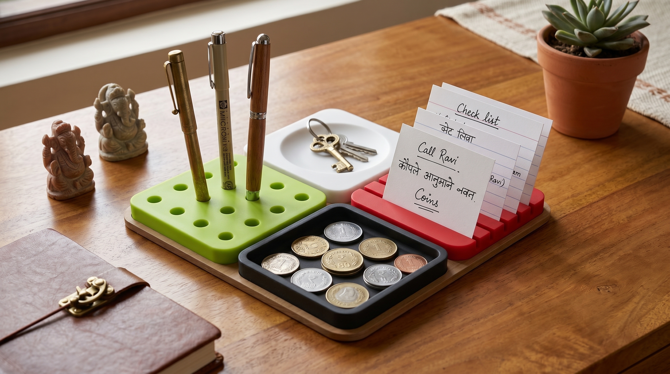
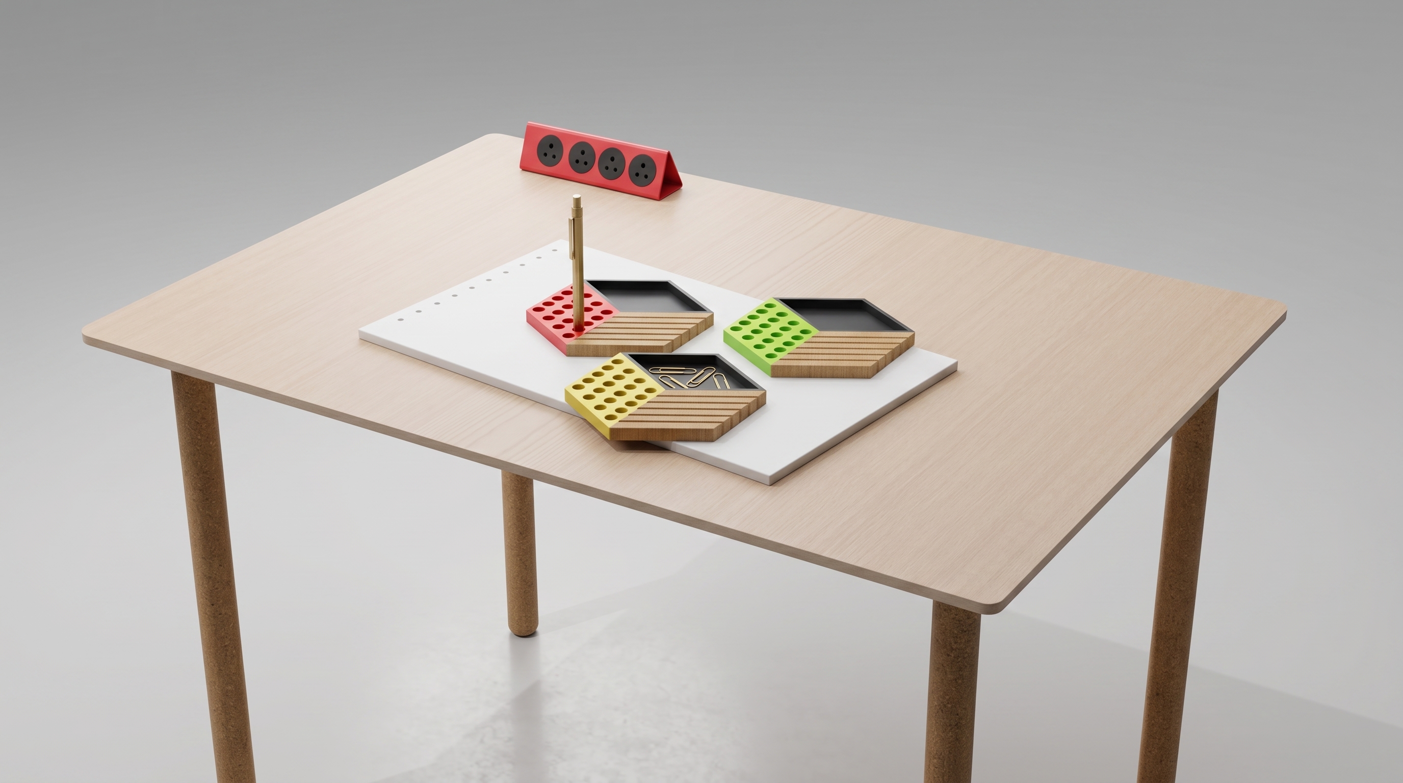
The aega Organizer — the anchor of the collection. Its three-compartment form and clean geometric edges set the visual language shared by every other piece. Click any image to enlarge.
"The best object on a desk is the one you stop noticing — because it has completely become part of how you work."
— Design intent behind the aega collection
The Collection
Product by Product
01 / 05
Organizer
The Organizer is the anchor of the collection — the piece most likely to be the first thing you see on a desk. Three compartments at graduated depths: the tallest for pens, scissors, and rulers; the mid-depth for markers and styli; the shallowest for business cards and small tools.
The divider walls are chamfered at their top edges, making it easy to reach in and pull out a specific item without disturbing everything else. The exterior walls taper by 2° — just enough to read as intentional, not enough to compromise stacking.
02 / 05
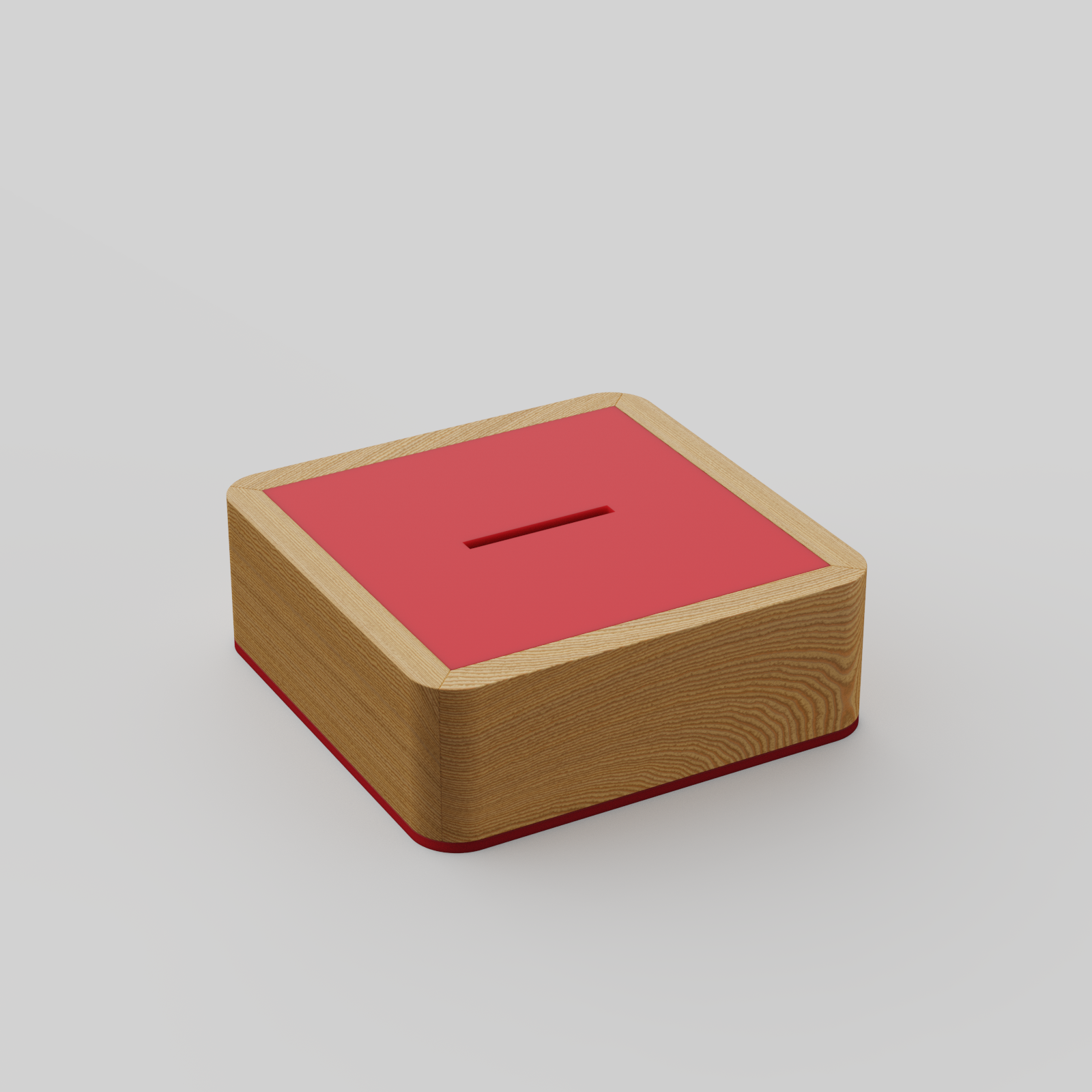
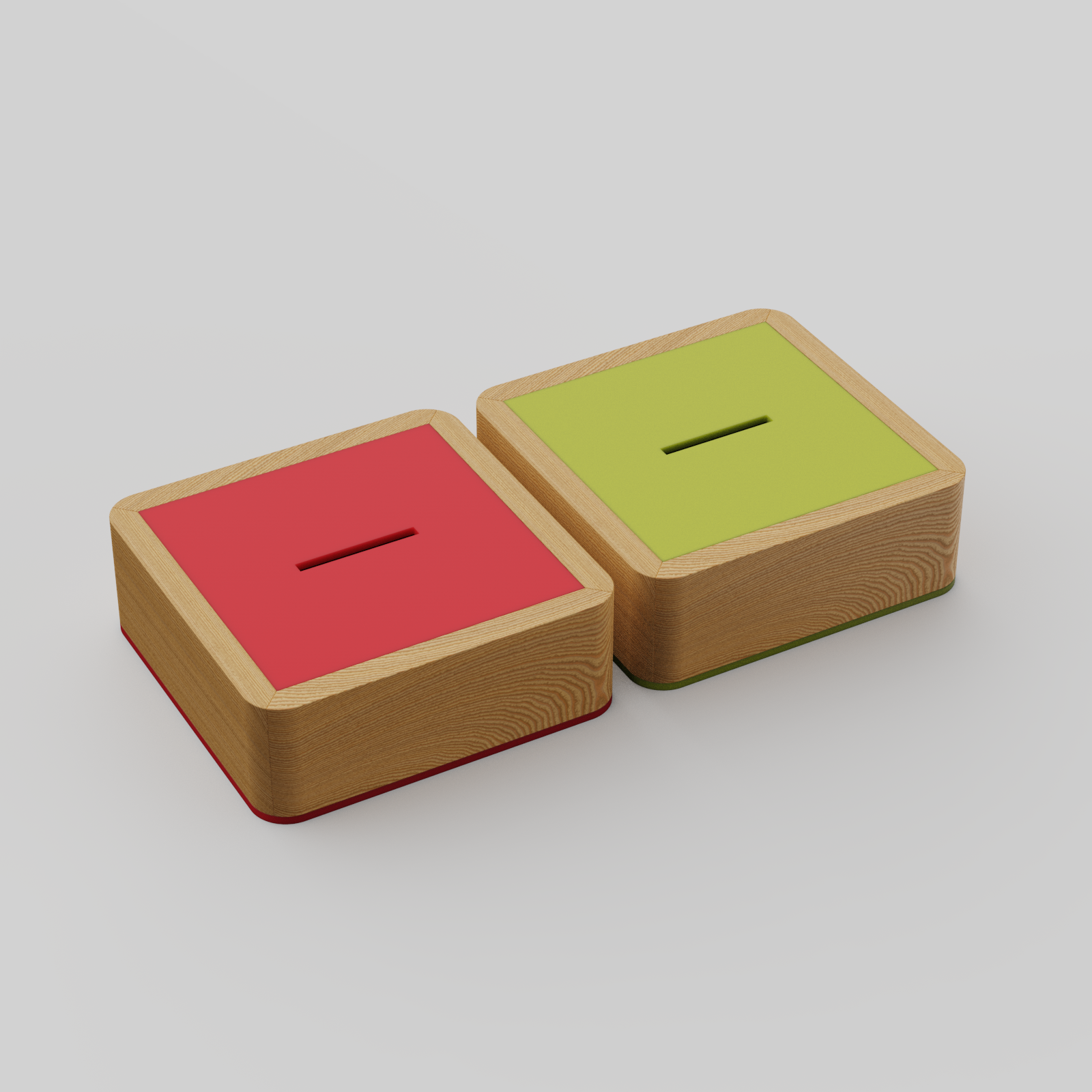
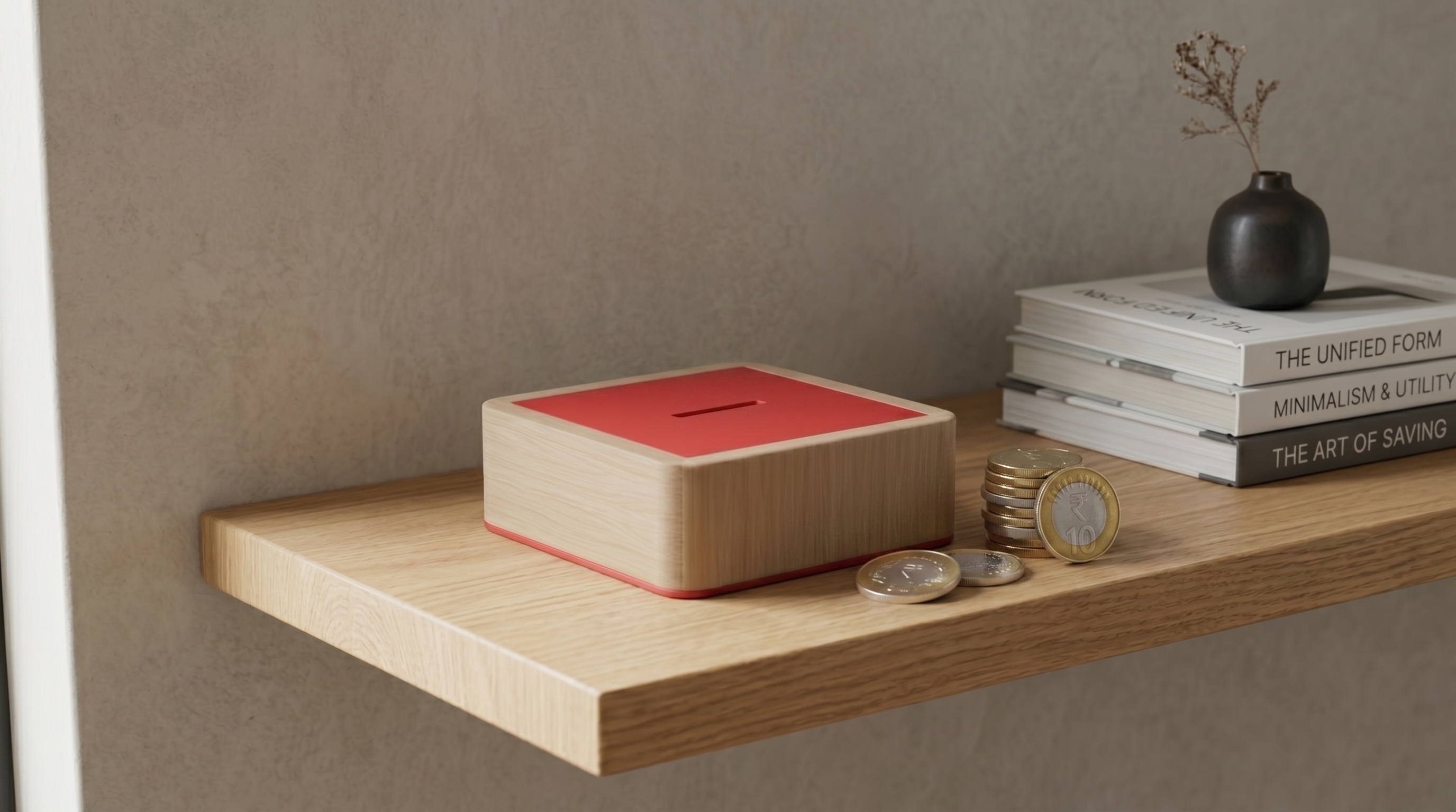
Coin Box
Every pocket generates residue: loose coins, spare SIM card tools, rings you take off at the desk, spare buttons, an errant earring. The Coin Box gives these objects a designated home — compact, lidded, and satisfying to use.
The lid friction-fits with deliberate resistance — firm enough to feel intentional, light enough to open one-handed. The same 45° chamfer used on the Organizer's dividers appears at the lid perimeter, tying the two pieces together visually. The base footprint is small enough to tuck into a corner; the height is tall enough to be easy to open.
03 / 05
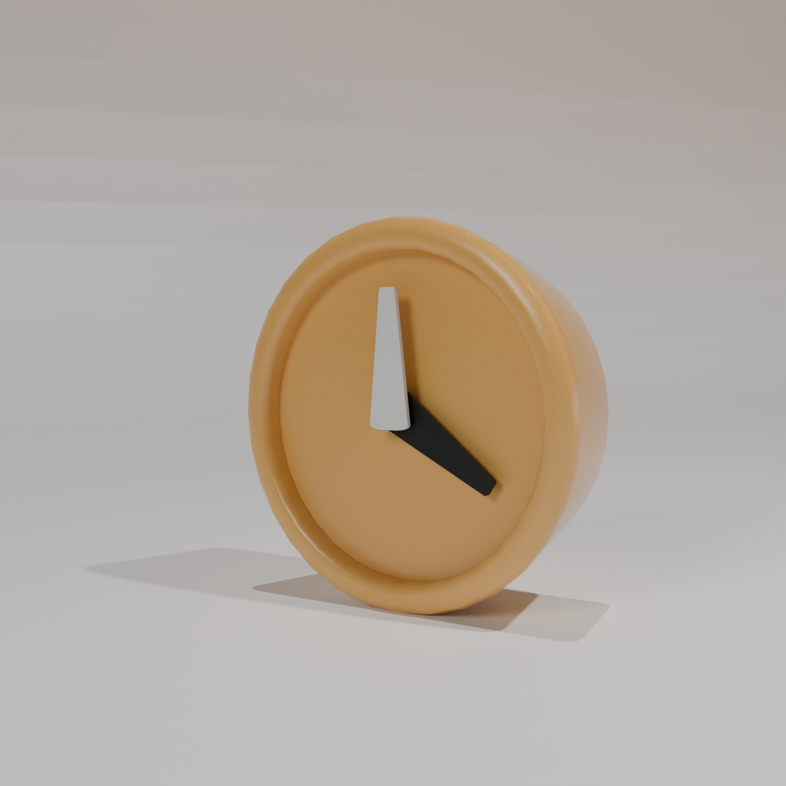
Clock
A timepiece that reads the time without performing it. There are no numerals on the face — just clean quadrant geometry and two flat-cut hands oxidised dark against the pale dial. The information is there; the decoration is not.
The Clock works flat on a desk or mounted to a wall. When desk-mounted, a minimal angled stand props it at 15° — readable at a glance without requiring a tilt of the head. The case profile echoes the Organizer's wall geometry: the same radius, the same wall thickness, the same deliberate anonymity.
04 / 05
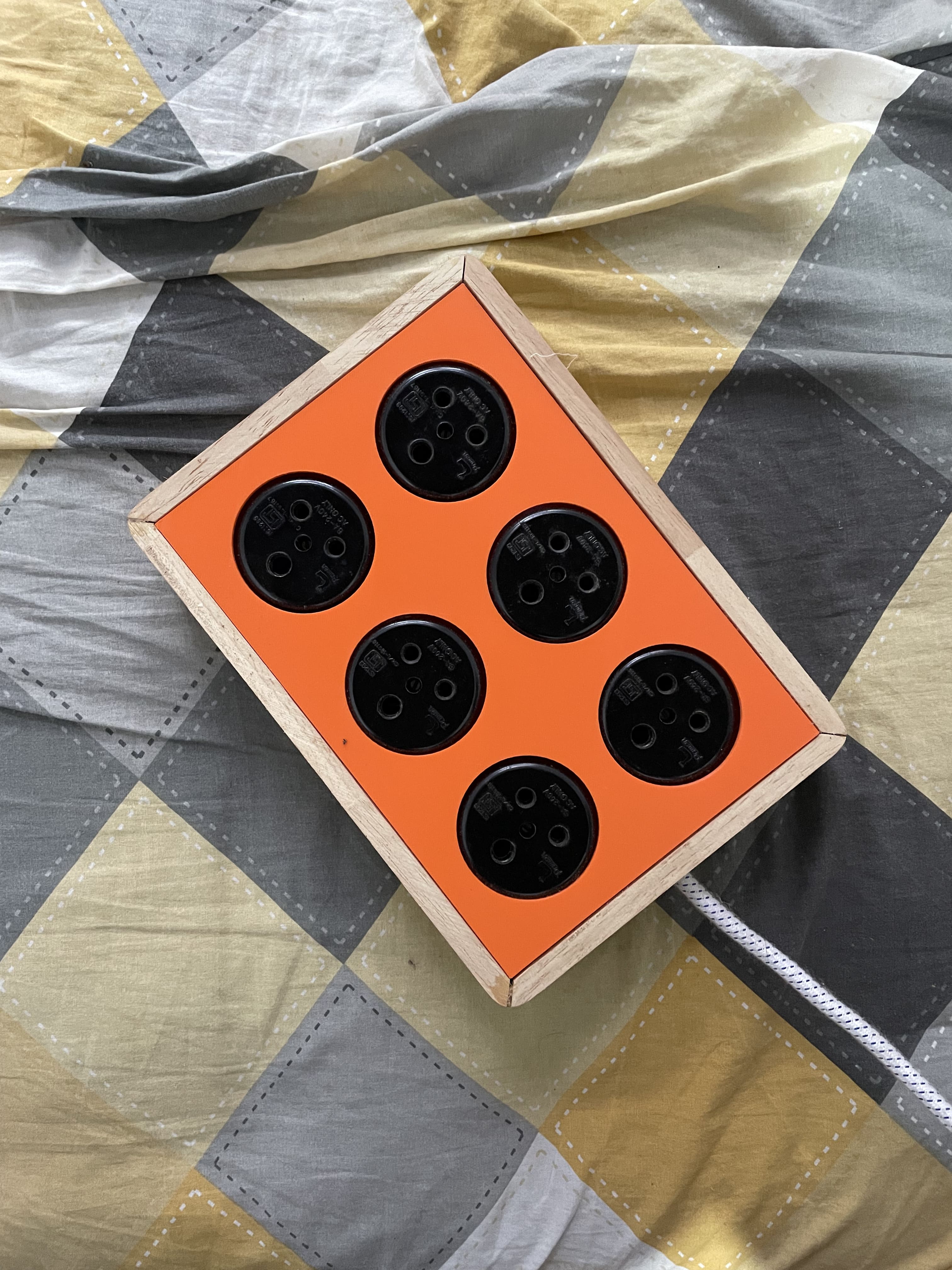
Hexa Organizer
The hexagon is the most efficient shape for tiling a plane — maximum area, minimum perimeter, zero wasted space when packed together. The Hexa Organizer uses that logic to create a tray for the objects that resist categorisation: earbuds, cable clips, push pins, rings, memory cards.
The geometry is a deliberate departure from the Organizer's rectangularity — a counterpoint that makes both forms more interesting in proximity. The depth is shallow by design: deep enough to contain, shallow enough that you can see everything inside at a glance.
05 / 05
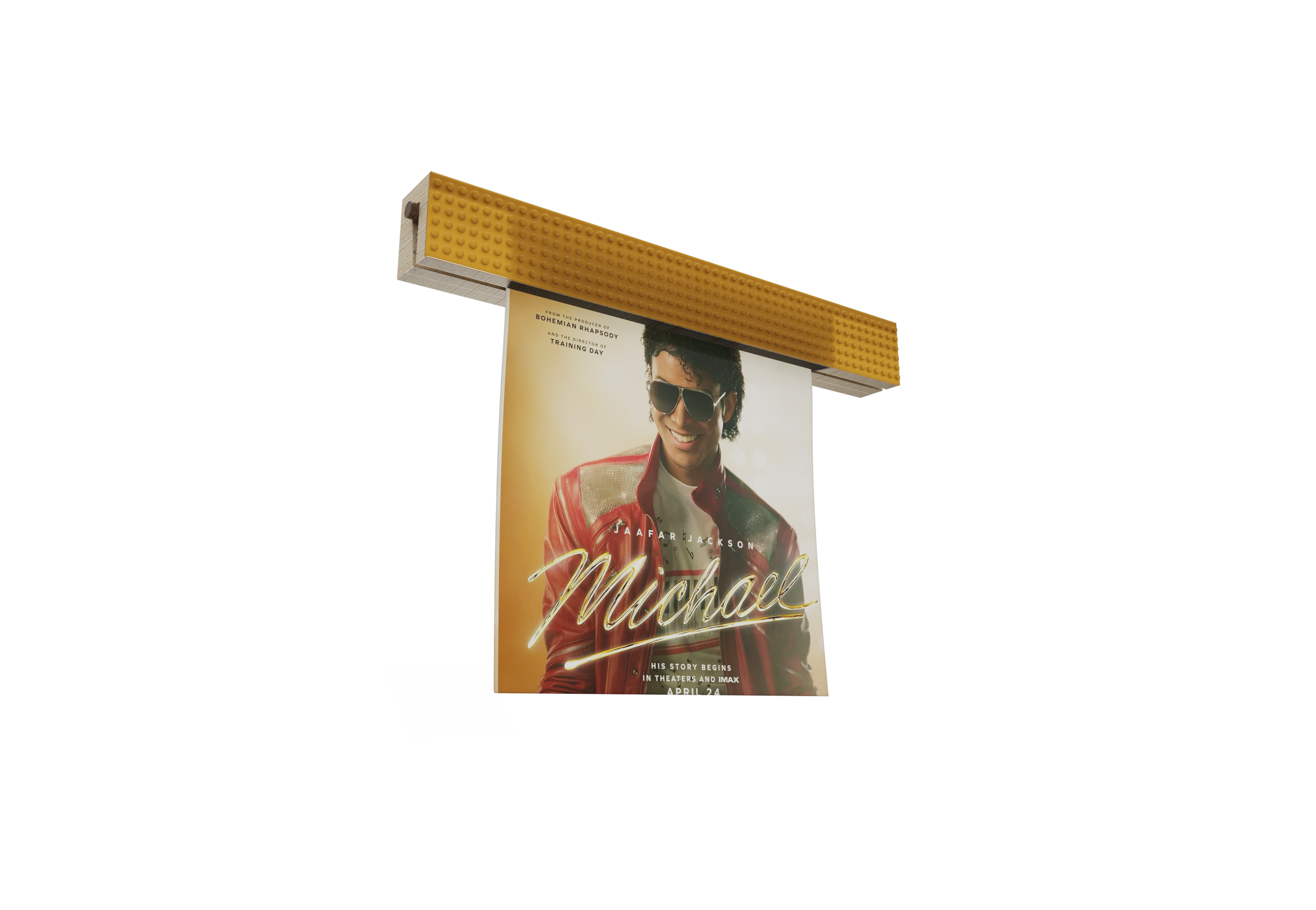
Display Bar
The Display Bar is the collection's only wall-mounted piece — a horizontal rail for hanging posters, prints, and notes. Its lower face has a standard poster-clamp mechanism; its upper face incorporates a Lego-compatible stud track.
That stud track allows the Hexa Organizer modules and other compatible clips to mount directly to the wall rail, keeping frequently-used items at eye level without taking up desk space. Display and lightweight storage on the same vertical plane — a vertical extension of the aega system into the space above the desk.
Design Language
Geometry as the Only Ornament
Every surface decision in the aega collection is a geometric one. The 45° chamfer that appears on the Coin Box lid also appears on the Organizer dividers. The radius used on the Clock case echoes the Organizer's corners. The collection holds together because the geometry is consistent — not because the pieces were styled to match.
Function Determines Form
Each product's shape is derived from what it needs to do, not from an aesthetic ambition imposed on top. The Organizer's graduated compartments exist because items have graduated heights. The Clock's numeral-free face exists because the hands provide sufficient information. The form is the minimum necessary to fulfil the function — nothing added, nothing withheld.
System Over Product
Designing five objects simultaneously revealed decisions that would have been invisible when designing one. The Hexa Organizer's depth is informed by the Coin Box's height — they can sit side by side without one visually dominating. The Display Bar's mount track accepts the Hexa module because both were designed with that connection in mind from the start.
Design Process
Audit & Problem Mapping
Began by cataloguing every object currently living on a typical desk. Mapped each object against its function, its frequency of use, and the visual noise it contributed. The brief that emerged: replace the noisiest, most-used objects with equivalents that share a visual language.
Vocabulary Development
Before designing any individual product, established the shared rules: a maximum wall thickness, a single chamfer angle, a radius to be applied consistently, and a constraint that no surface should introduce an element that another product doesn't share. The vocabulary came first; the products followed from it.
Simultaneous Form Development
All five products were modelled in parallel rather than sequentially. This forced proportional decisions to be made relative to the other pieces — the Coin Box's footprint was sized so it could sit beside the Organizer without visual conflict. Sequential design would have produced five independently optimised products; parallel design produced a system.
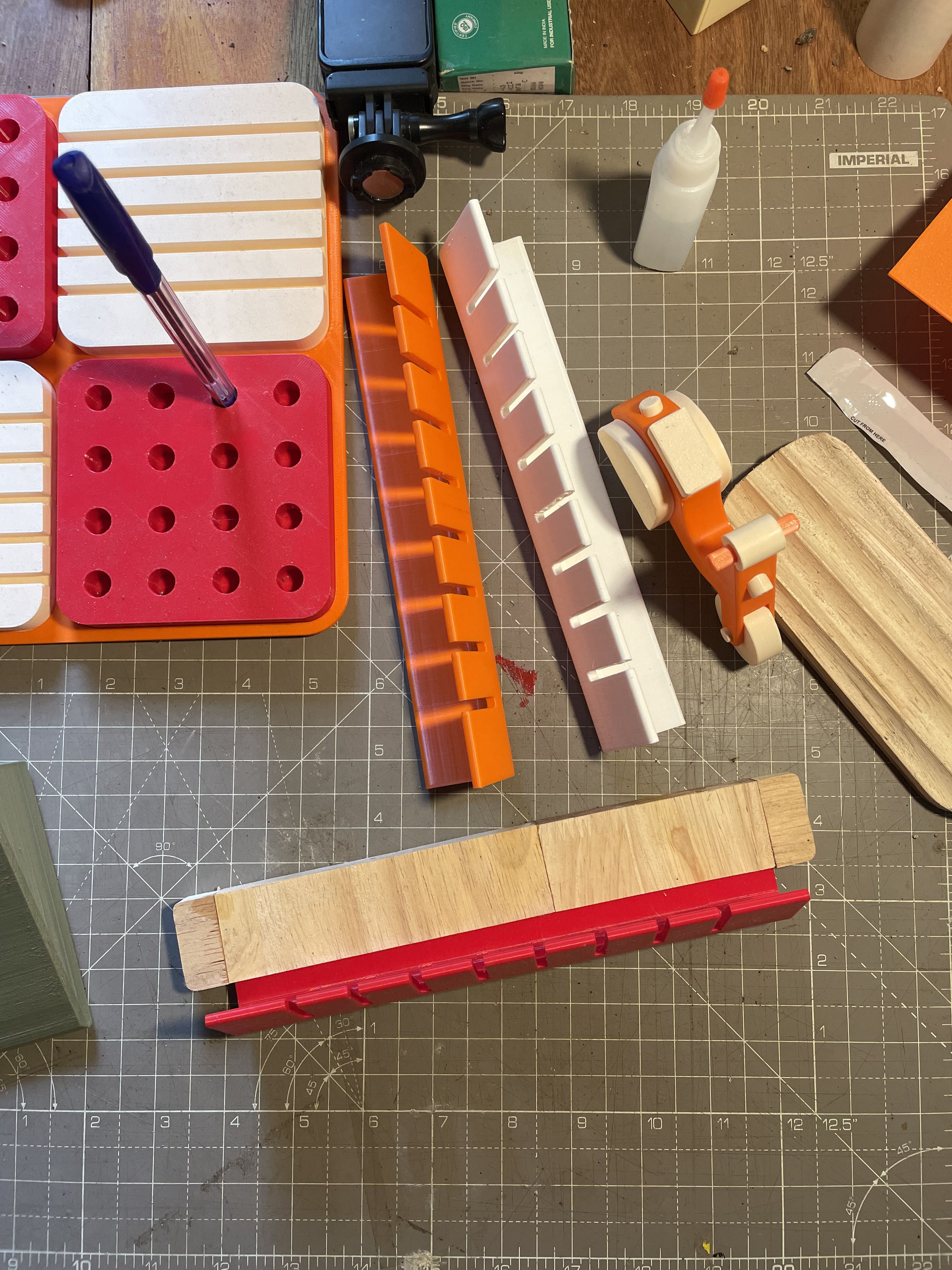
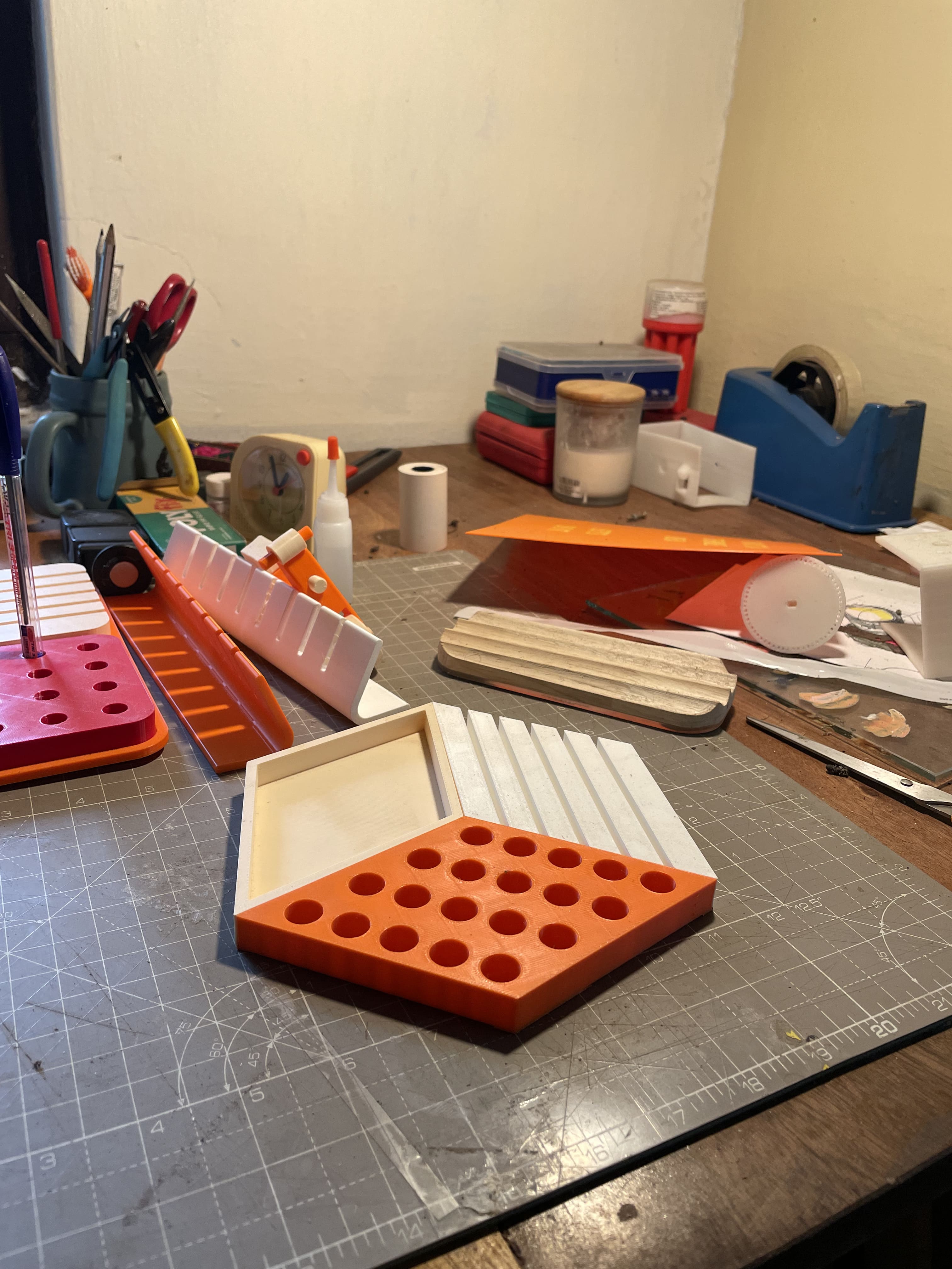
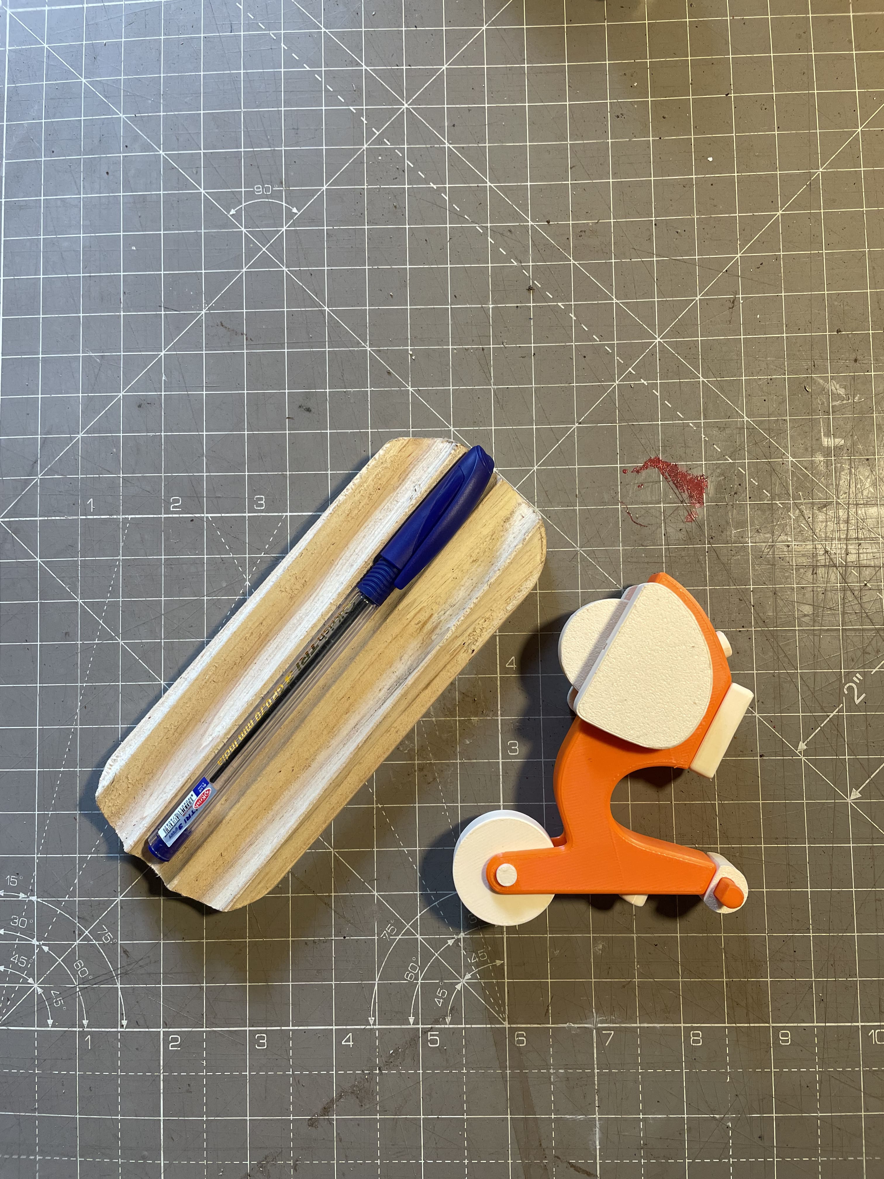
Prototype & Fit Study
Physical prototypes at 1:1 scale were assembled on an actual desk to test cohabitation. Proportions that read well in 3D renders sometimes felt wrong in the physical world — the Clock's case was narrowed after prototyping revealed it competed visually with the Organizer when placed side by side.
Material & Finish Specification
The collection settled on a matte finish across all pieces — a decision that reduces visual competition between items and makes the geometric form the only thing you read. Each product was specified in its primary material (extruded aluminium, CNC ABS, cast resin, 3D-printed PLA) with the constraint that all finished surfaces must read as the same family.
Prototype Photography
Prototype photographs shot in natural window light. Render quality confirmed against physical prototypes before finalising surface specifications.
Reflections & Takeaways
Constraint is a Design Tool
Imposing a shared vocabulary across five products before any individual form was developed turned out to be the single most useful decision in the project. Constraint eliminated entire categories of formal choices and directed energy toward the decisions that actually mattered: proportions, fit, finish.
Parallel Design Reveals System Logic
Designing all five products simultaneously produced relationships between pieces that sequential design would never have found. The Hexa Organizer's compatibility with the Display Bar's mount track wasn't in the original brief — it emerged naturally from having both products in the same design space at the same time.
The Prototype Overrules the Render
Two products were significantly revised after physical prototyping. Screen-accurate proportions and desk-accurate proportions are not the same thing. The Clock's case was narrowed; the Organizer's tallest compartment was deepened. Neither change was visible in the rendered images — both were immediately obvious in person.
Coherence Compounds Value
Any single product in the aega collection is a competent desk object. As a set, they produce something more than their sum: a sense that the desk has been deliberately considered rather than accumulated by chance. That perception of intent is the real product the collection delivers.